
Objective: The objective of this project is to create a comprehensive dashboard using Tableau for analyzing employee attrition within a company. By leveraging various visualizations, the dashboard provides insights into factors such as gender, department, age group, job satisfaction, and education field that may influence attrition rates. This tool aims to assist HR professionals and decision-makers in understanding patterns and making informed strategies to improve employee retention.
Data Cleaning: The project begins with data cleaning, where the provided dataset containing information about employees is processed. Columns such as ‘Attrition’, ‘Business Travel’, ‘Age’, ‘Gender’, ‘Department’, ‘Job Role’, ‘Marital Status’, and others are cleaned to remove any inconsistencies or missing values.
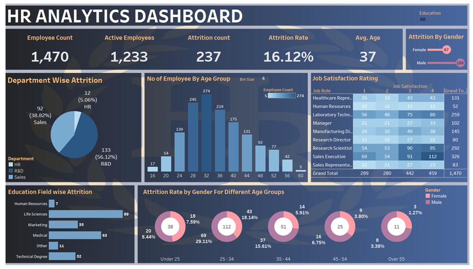
Key Performance Indicators (KPIs): A KPI sheet is designed to showcase the overall active employee count and the attrition rate. This serves as a quick glance for stakeholders to understand the current state of employee turnover within the organization.
Attrition by Gender: A visualization is created to represent the attrition rate based on gender. This breakdown helps in identifying if there are gender-specific trends in employee attrition.
Department-wise Attrition: The dashboard includes a section that categorizes attrition rates based on different departments. This allows decision-makers to pinpoint areas where attrition is more prominent and potentially address specific departmental concerns.
Employee Distribution by Age Group: A graphical representation is provided to show the distribution of employees across different age groups. This aids in understanding the age demographics of the workforce and identifying any age-specific attrition patterns.
Job Satisfaction Ratings: A visualization is created to depict the job satisfaction ratings within the organization. This can help in understanding the correlation between job satisfaction and attrition rates.
Education Field-wise Attrition: The dashboard includes a section dedicated to displaying attrition rates based on the education field of employees. This information can be crucial in identifying whether certain fields of study are more prone to attrition.
Attrition Rate by Gender for Different Age Groups: An insightful visualization is designed to show how attrition rates vary across different age groups for both genders. This can highlight if there are specific age ranges where attrition is more prevalent for a particular gender.
Overall Dashboard: All the above visualizations are integrated into a cohesive dashboard that provides a holistic view of employee attrition. Interactive filters and tooltips are incorporated to enhance user experience and allow stakeholders to explore the data more dynamically.
Conclusion: This Tableau dashboard serves as a powerful tool for HR professionals and organizational leaders to gain actionable insights into employee attrition. By analyzing patterns and trends, the dashboard empowers decision-makers to formulate targeted strategies aimed at improving employee retention and creating a more conducive work environment.